D&B帝标家居新零售
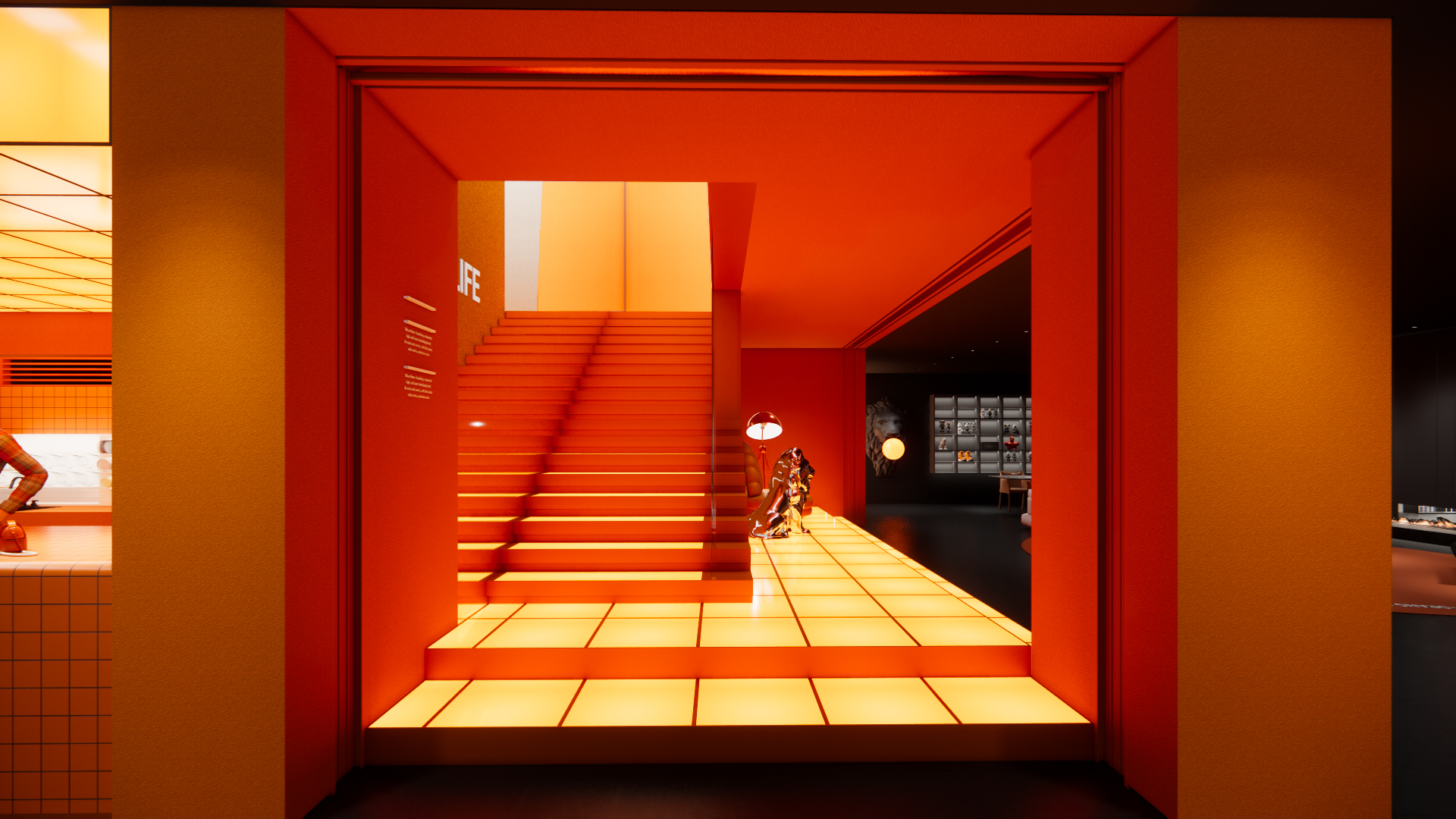
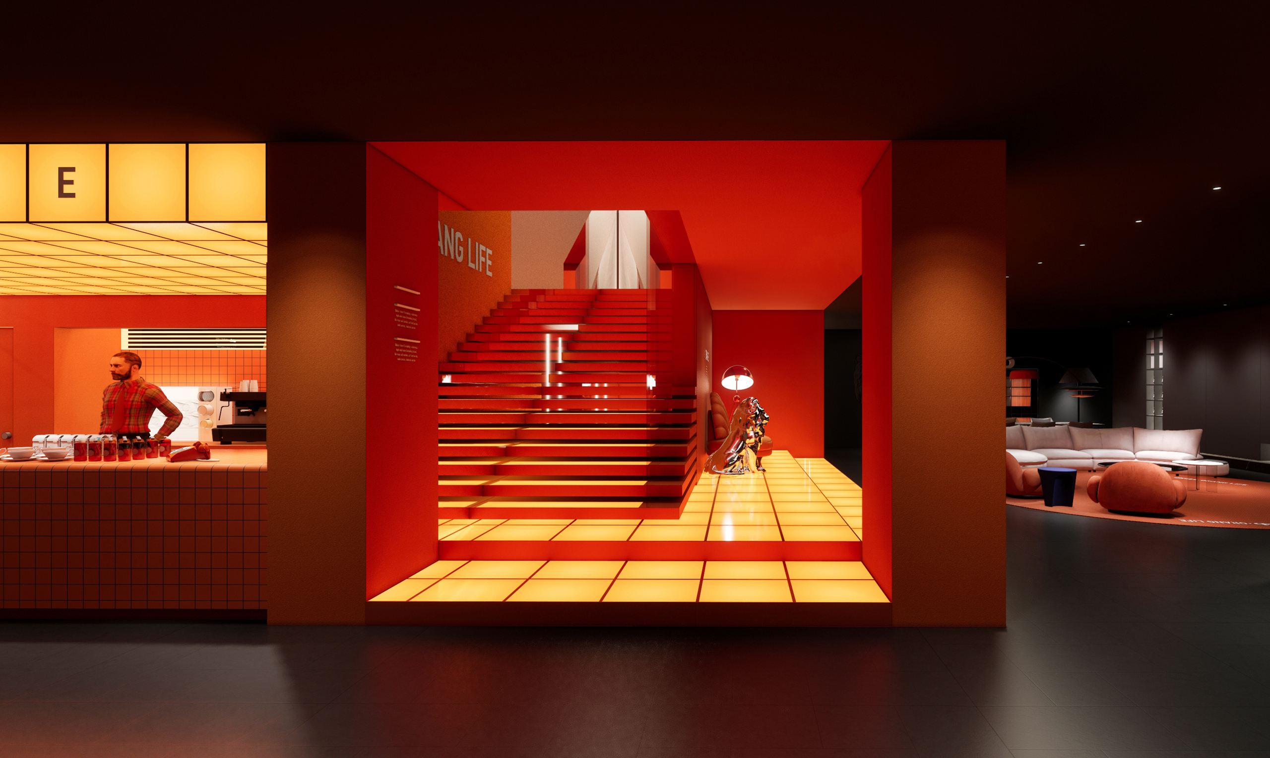
如橙色,鲜活、大胆而情绪化 —— 一面温暖,一面前卫。
项目面积 | 1715㎡
项目地点 | 四川·成都
设计总监 | 刘雪鹄 / 廖虹森
空间设计 | 李显强 / 王昊 / 曹永果
平面视觉 | 何季航
施工后期 | 李东东
当“年轻、潮流、社交”成为零售商业寻求改变的必选项,传统家居卖场也不是这场“热潮”的旁观者。
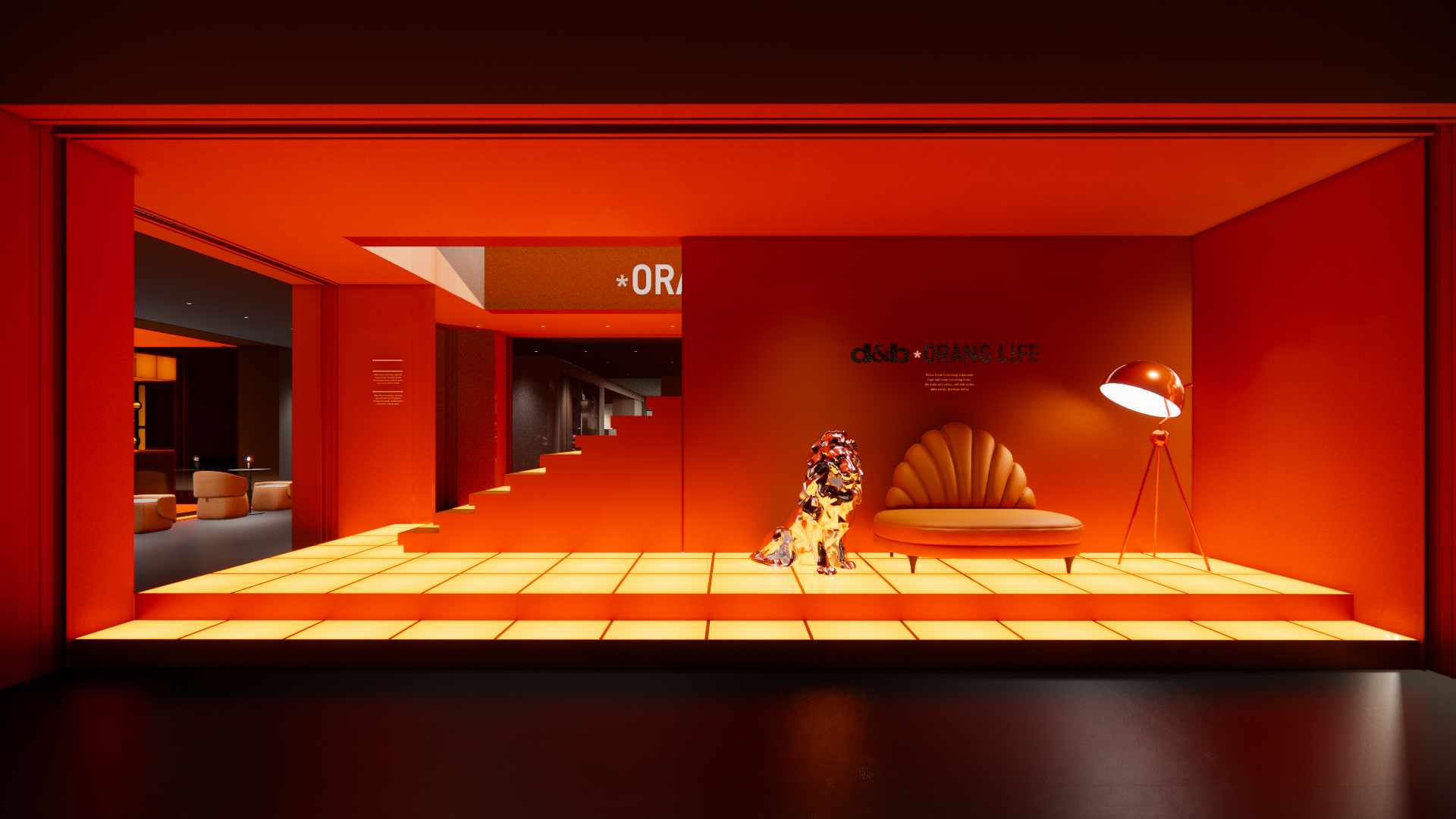
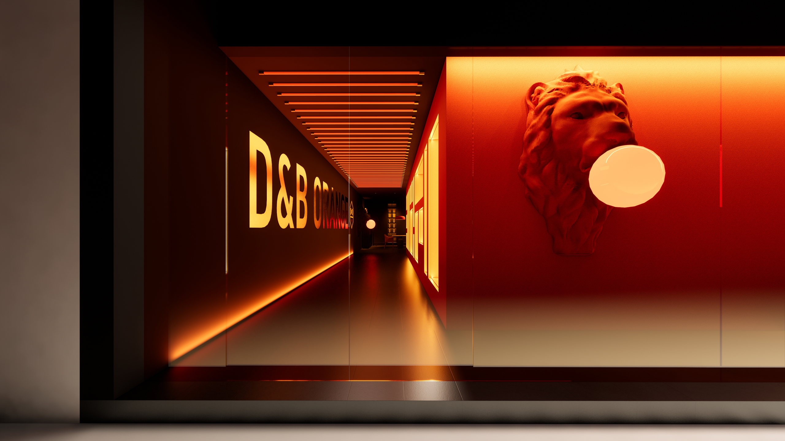
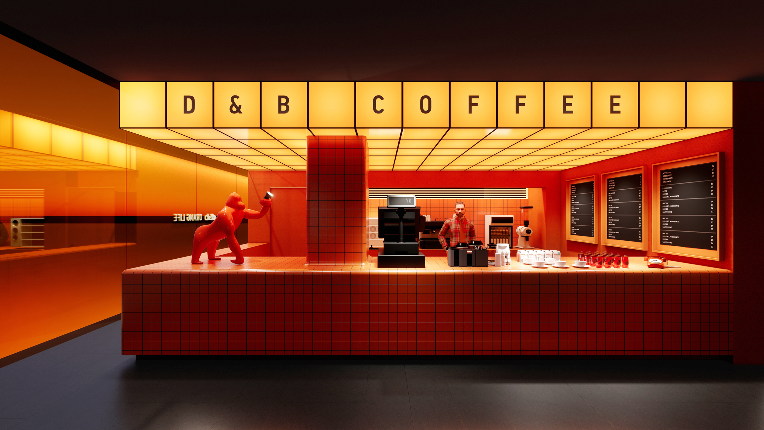
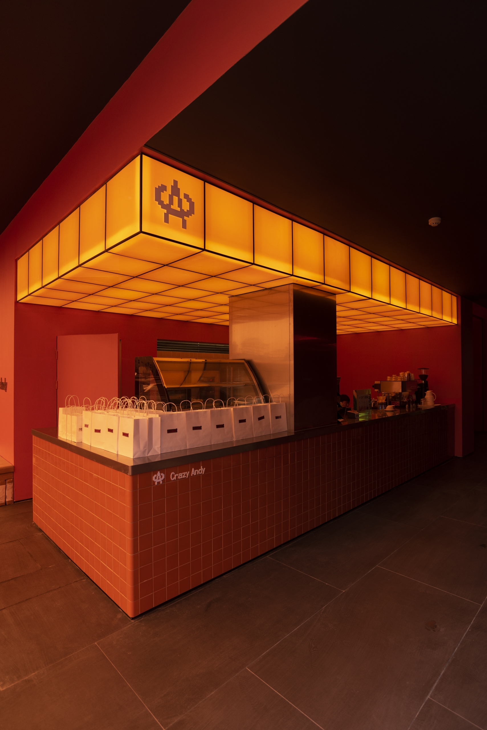
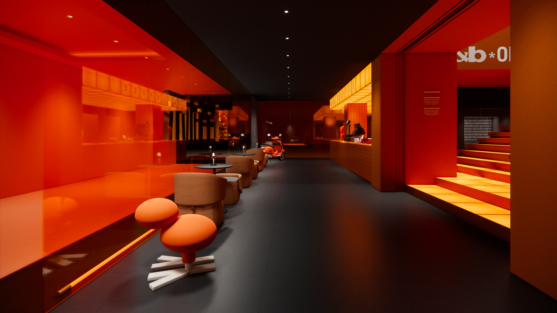
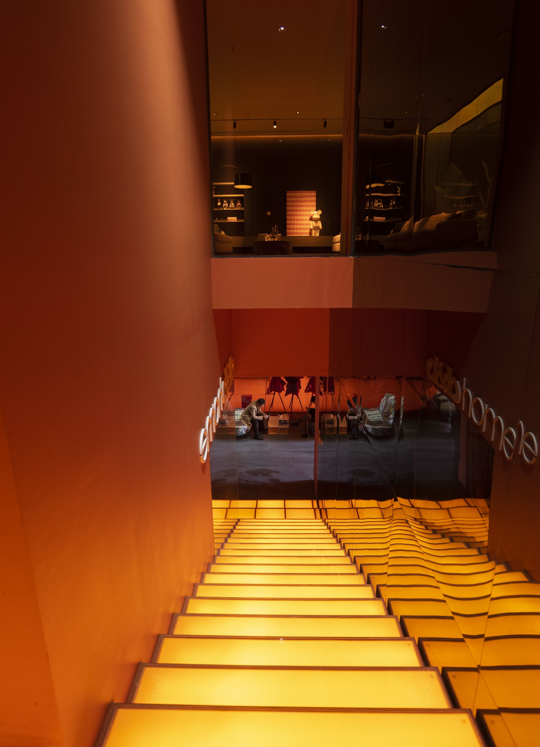
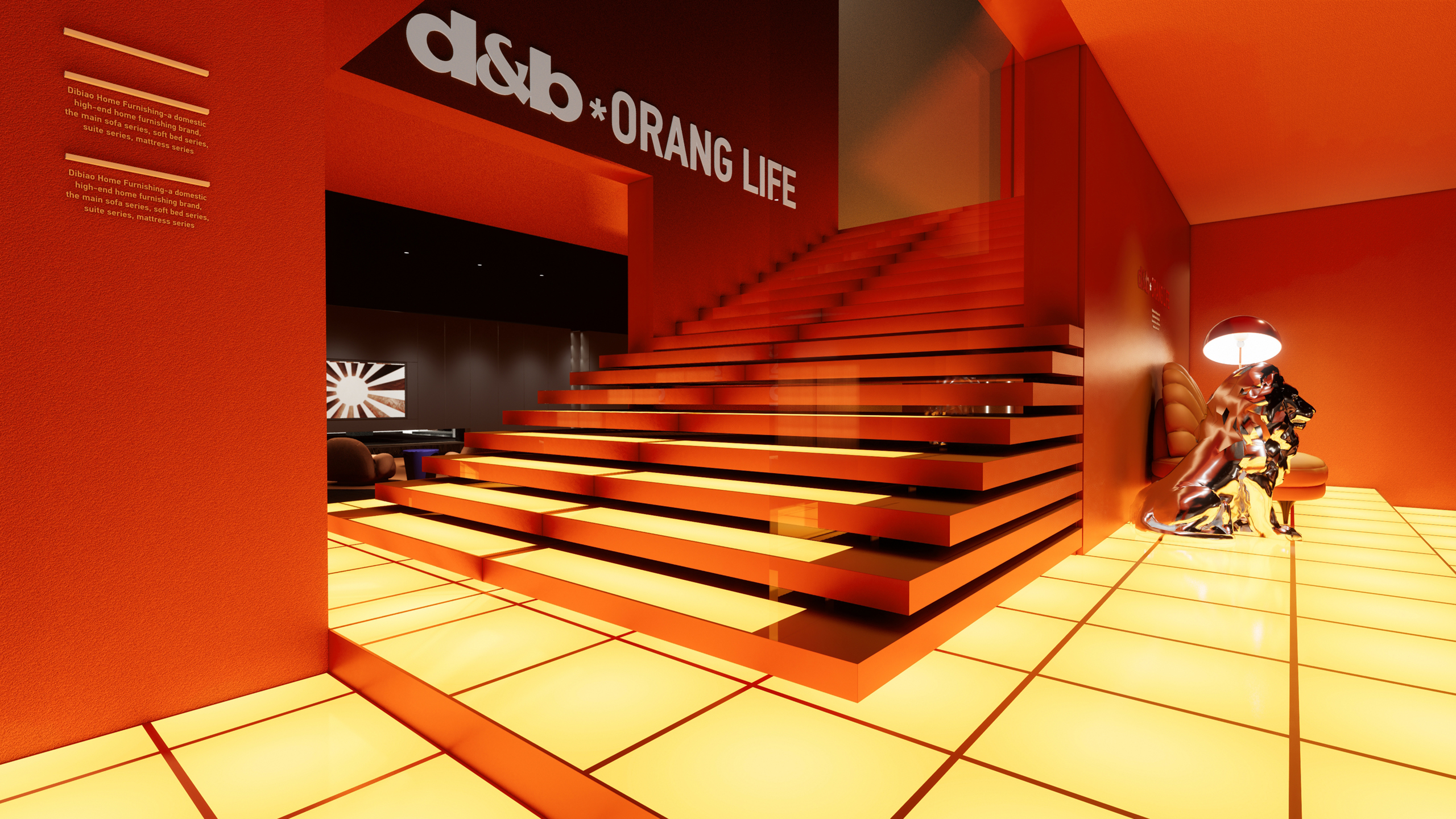
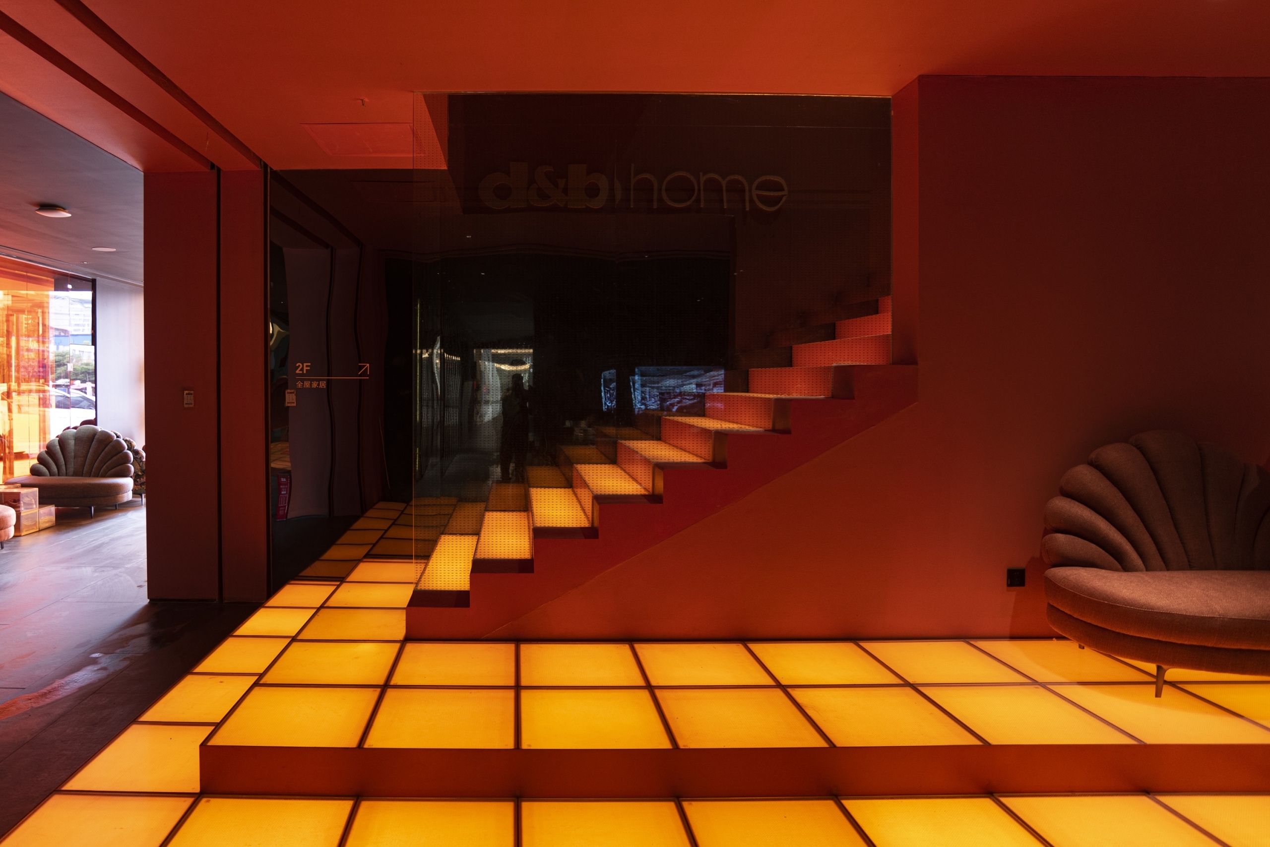
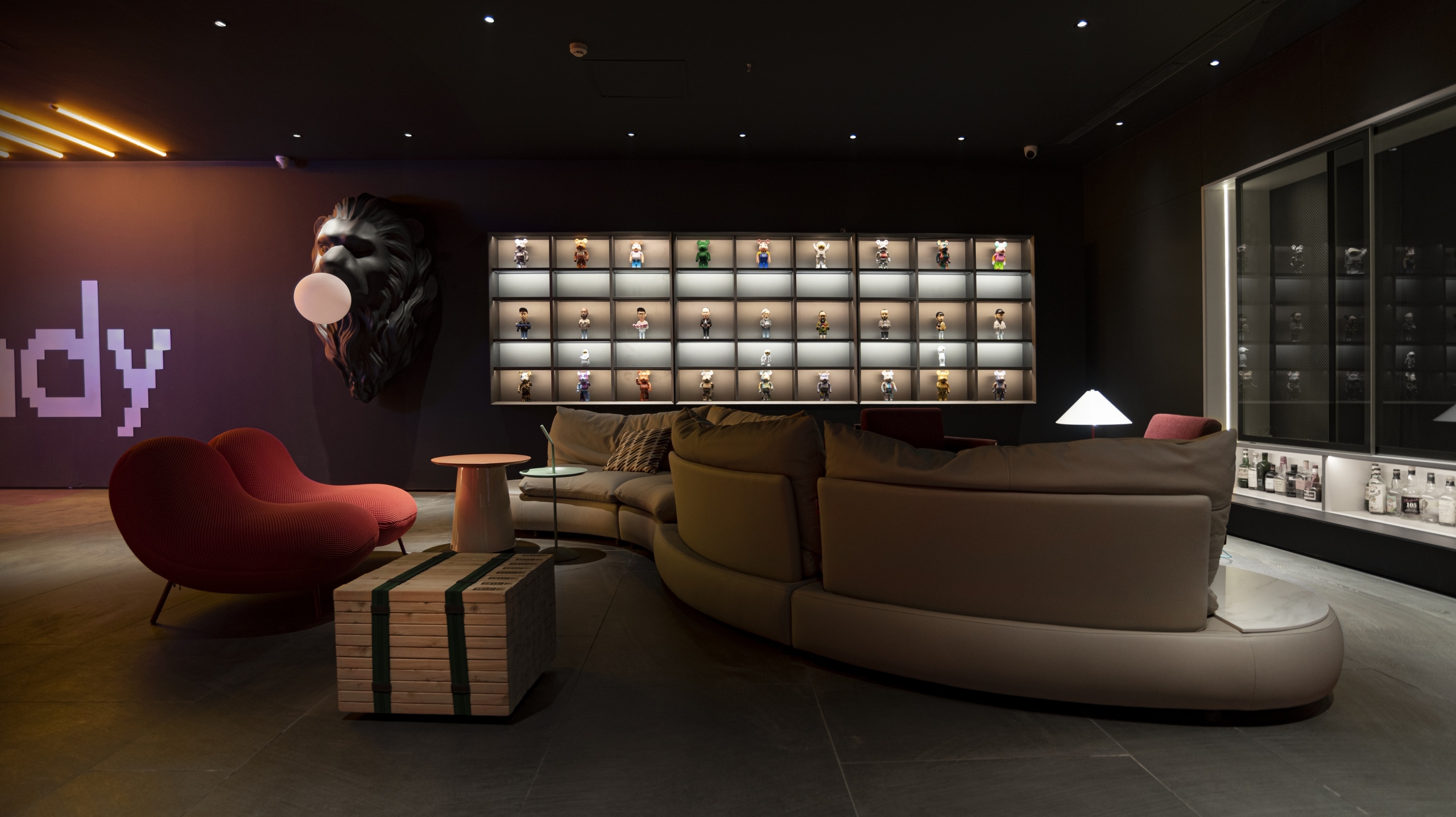
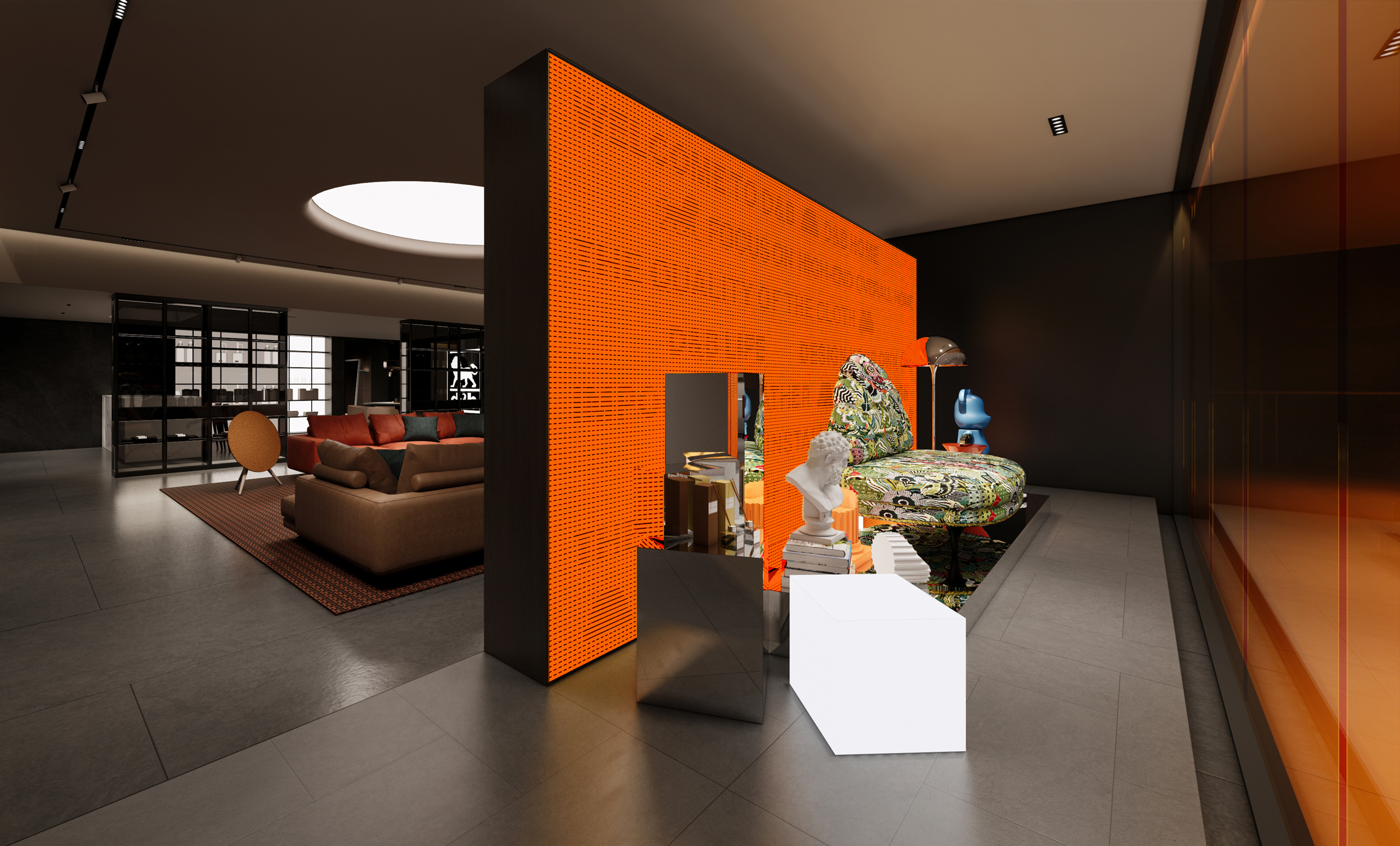
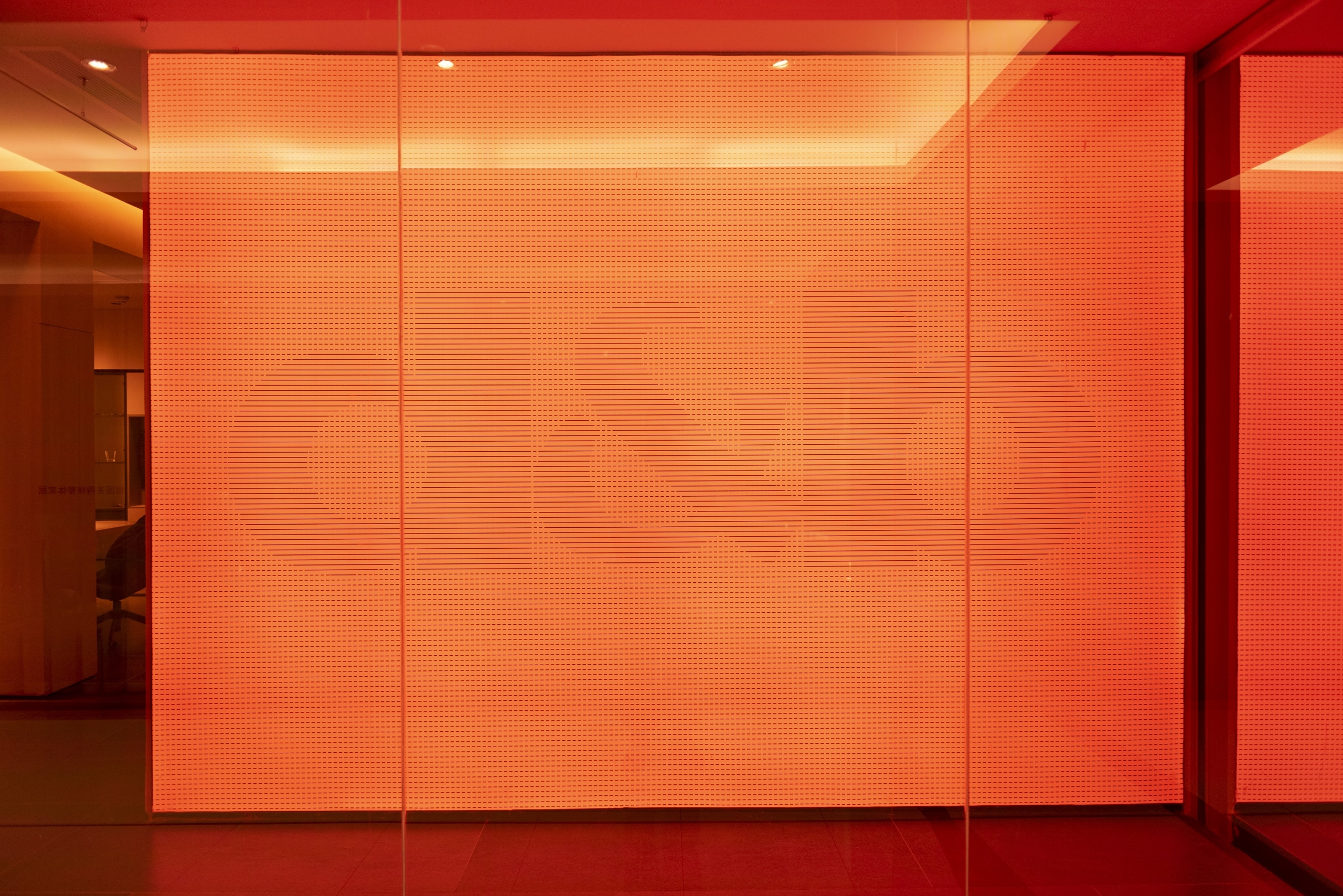
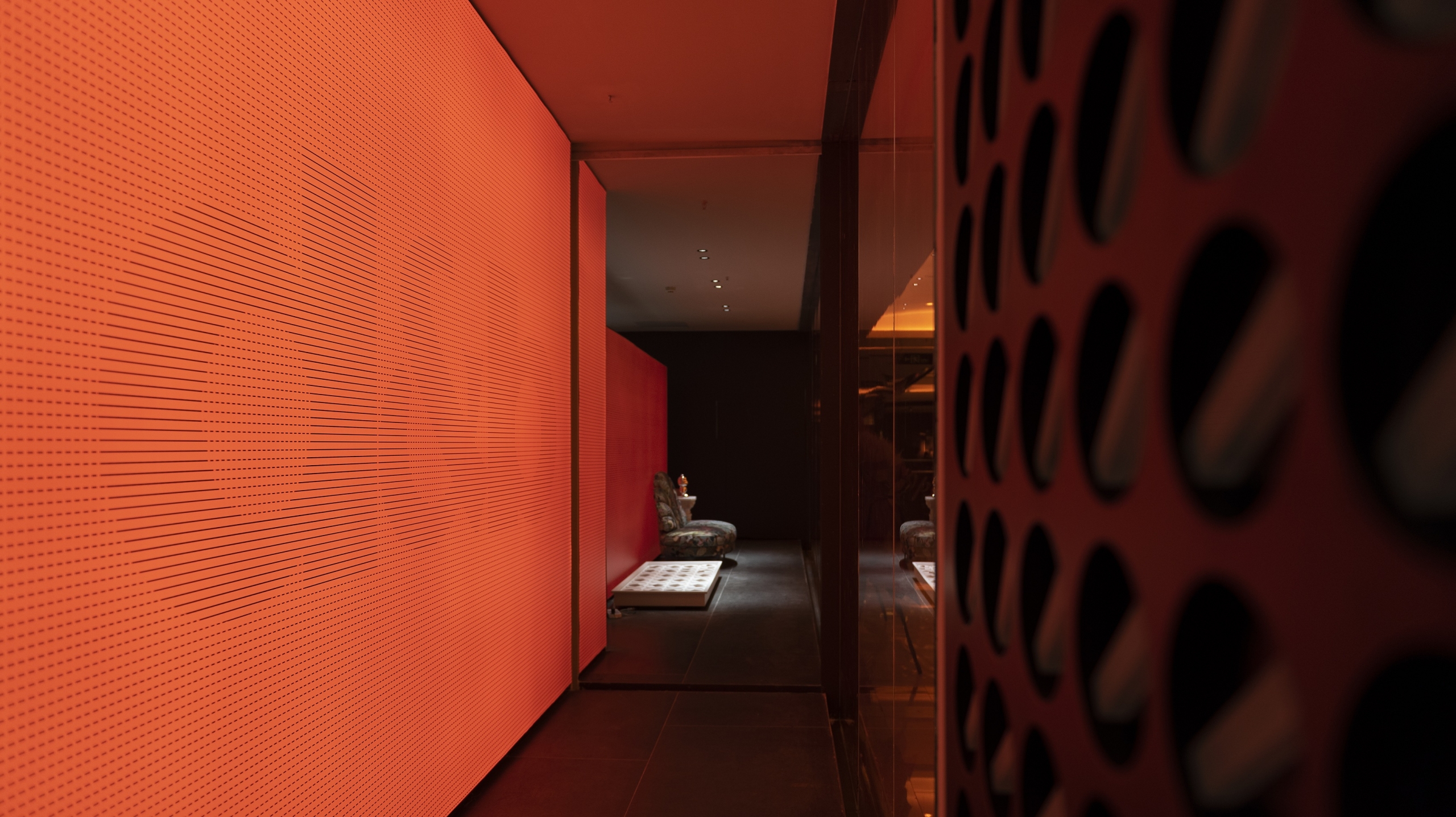
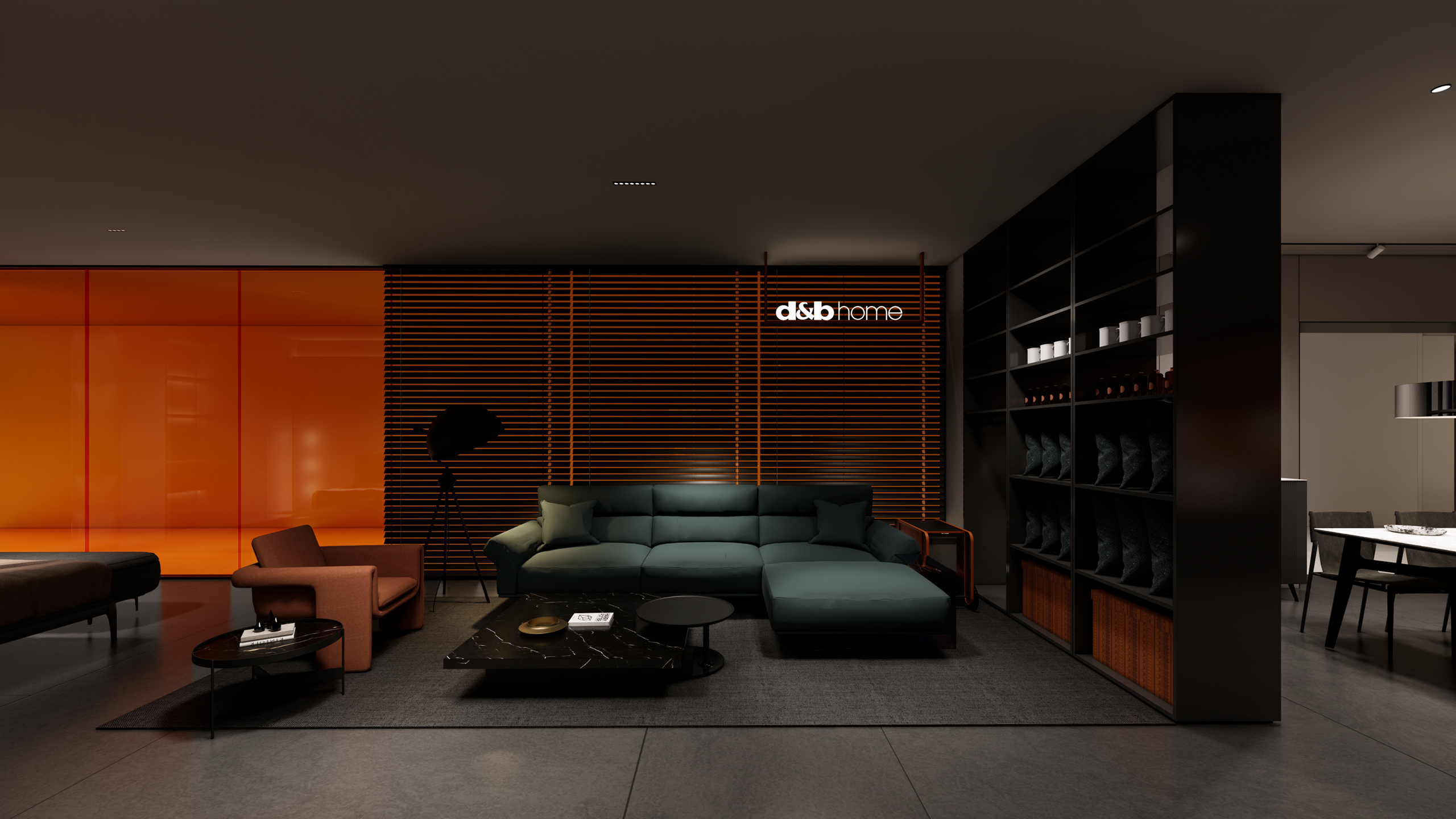
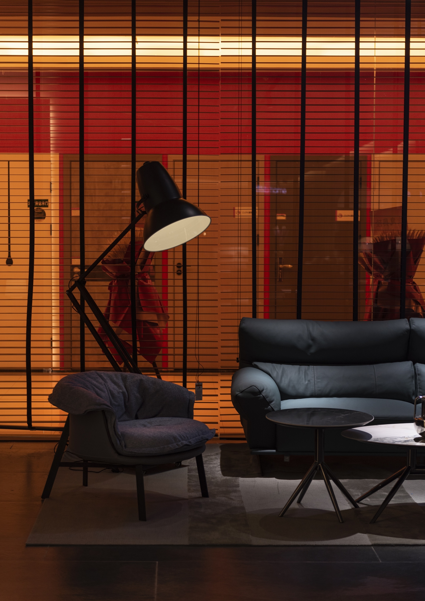
帝标家居D&B HOME在有形的终端空间中探寻无界的突破,让我们一次次看到传统家居卖场令人欣喜中带着意料之外的改变和“越界”。大面积的橙色材质、饰面与LED屏幕的使用,奠定了空间的风格基调,展示出一种更趋年轻和鲜活,明暗对比中甚至还有一丝“光怪陆离”的氛围感。
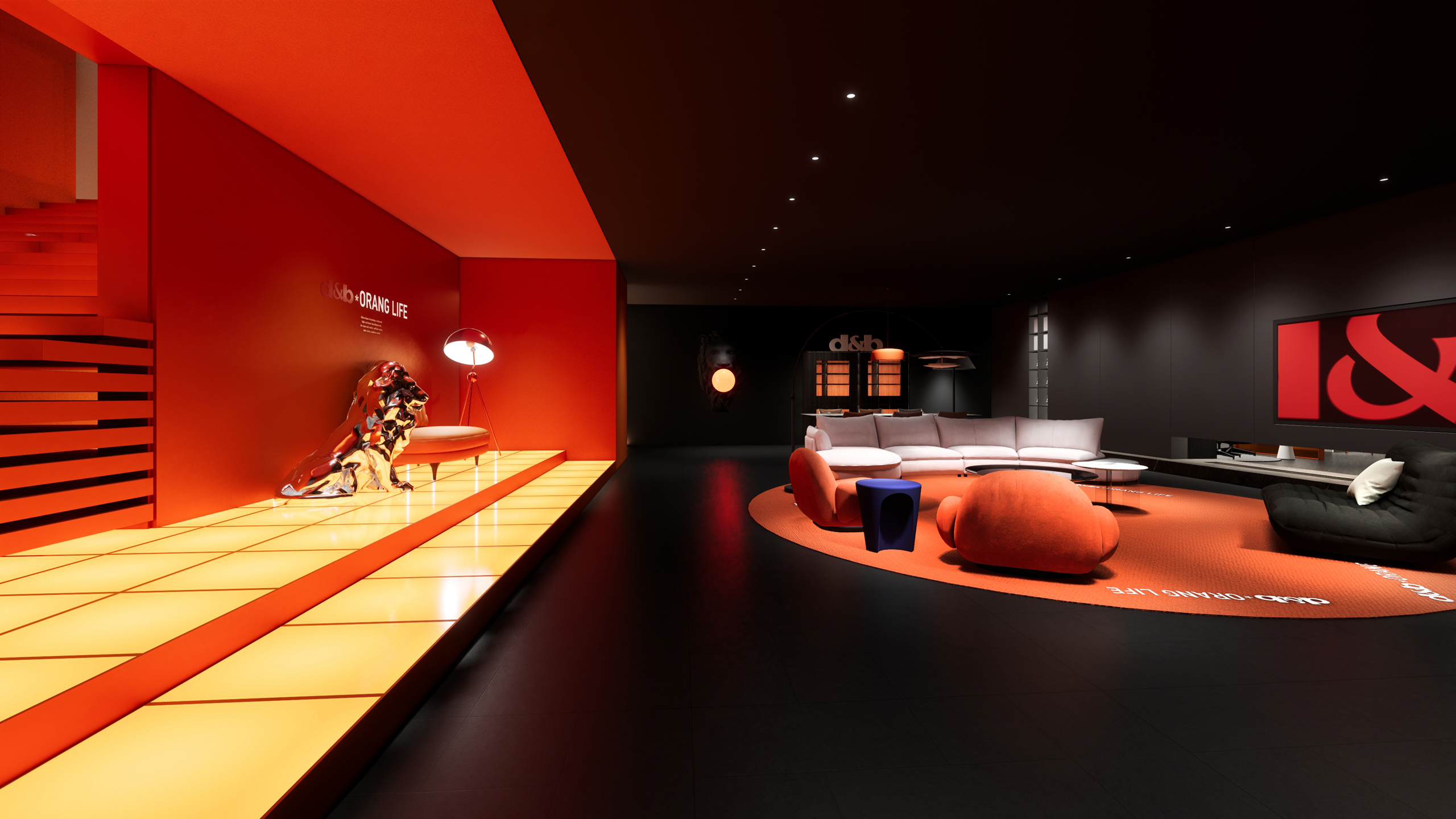
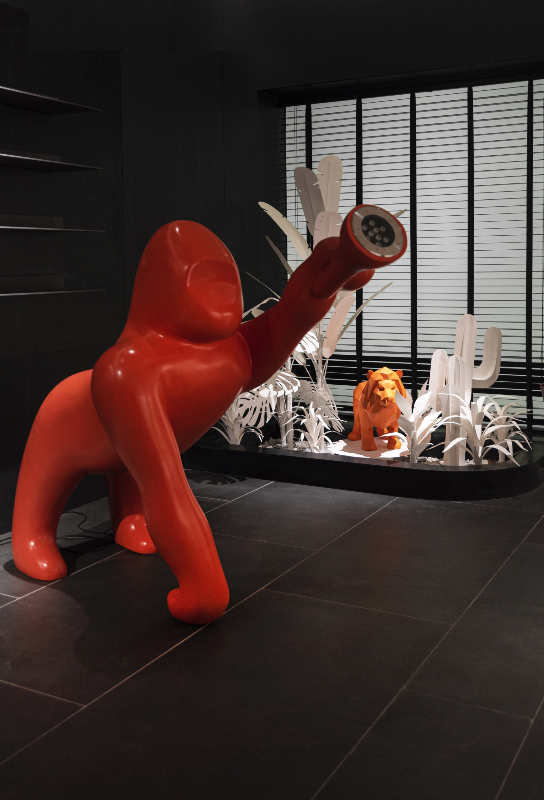
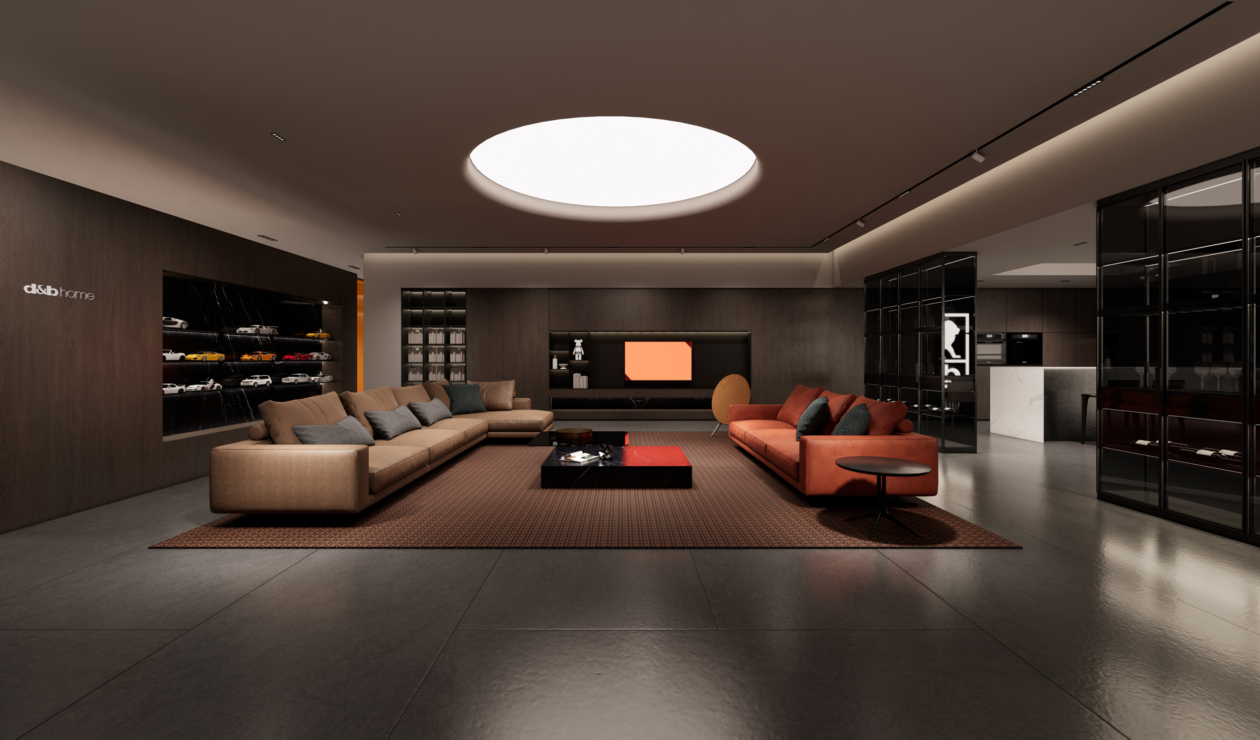
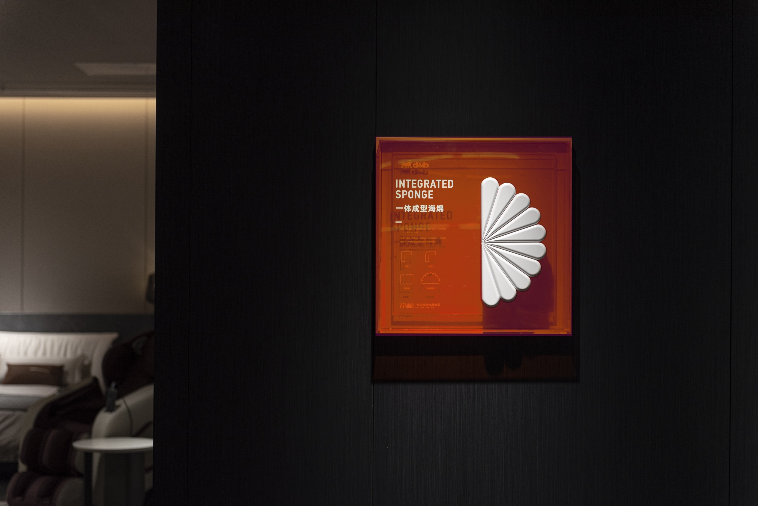
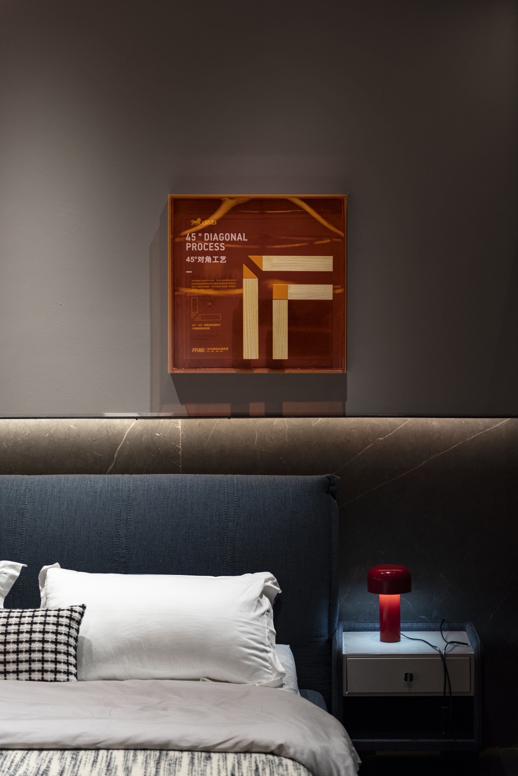
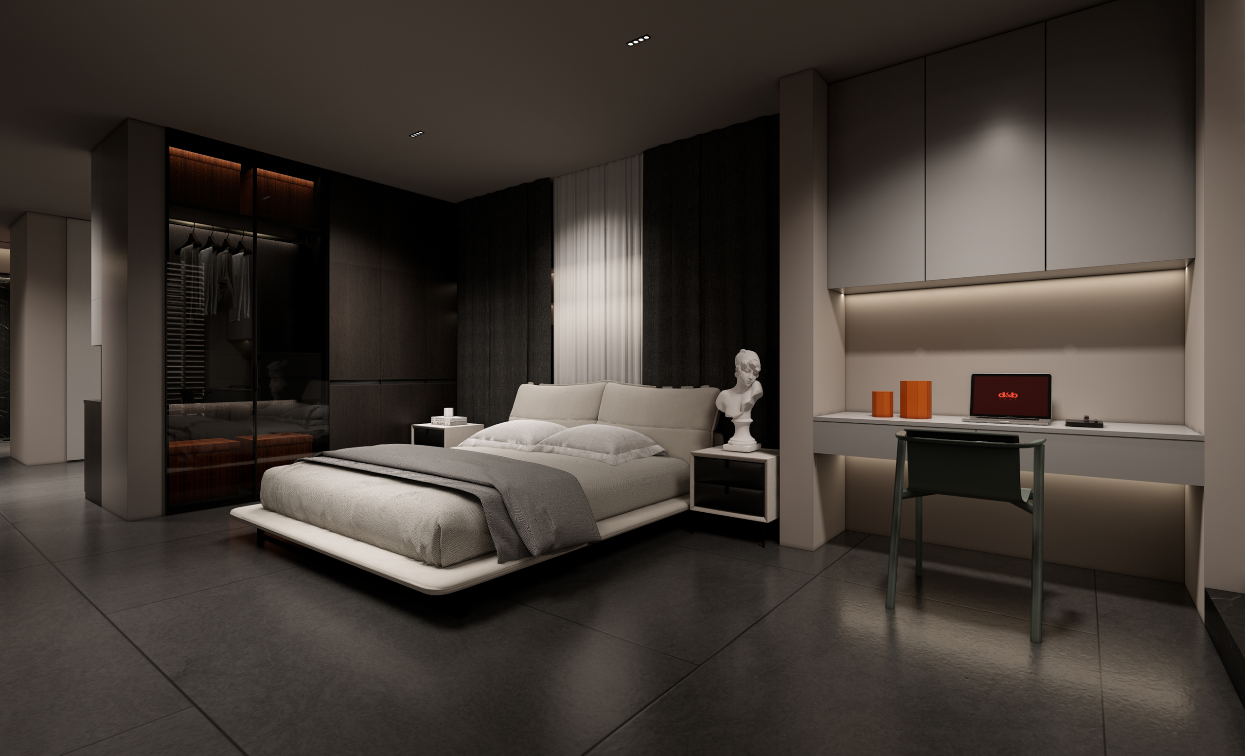
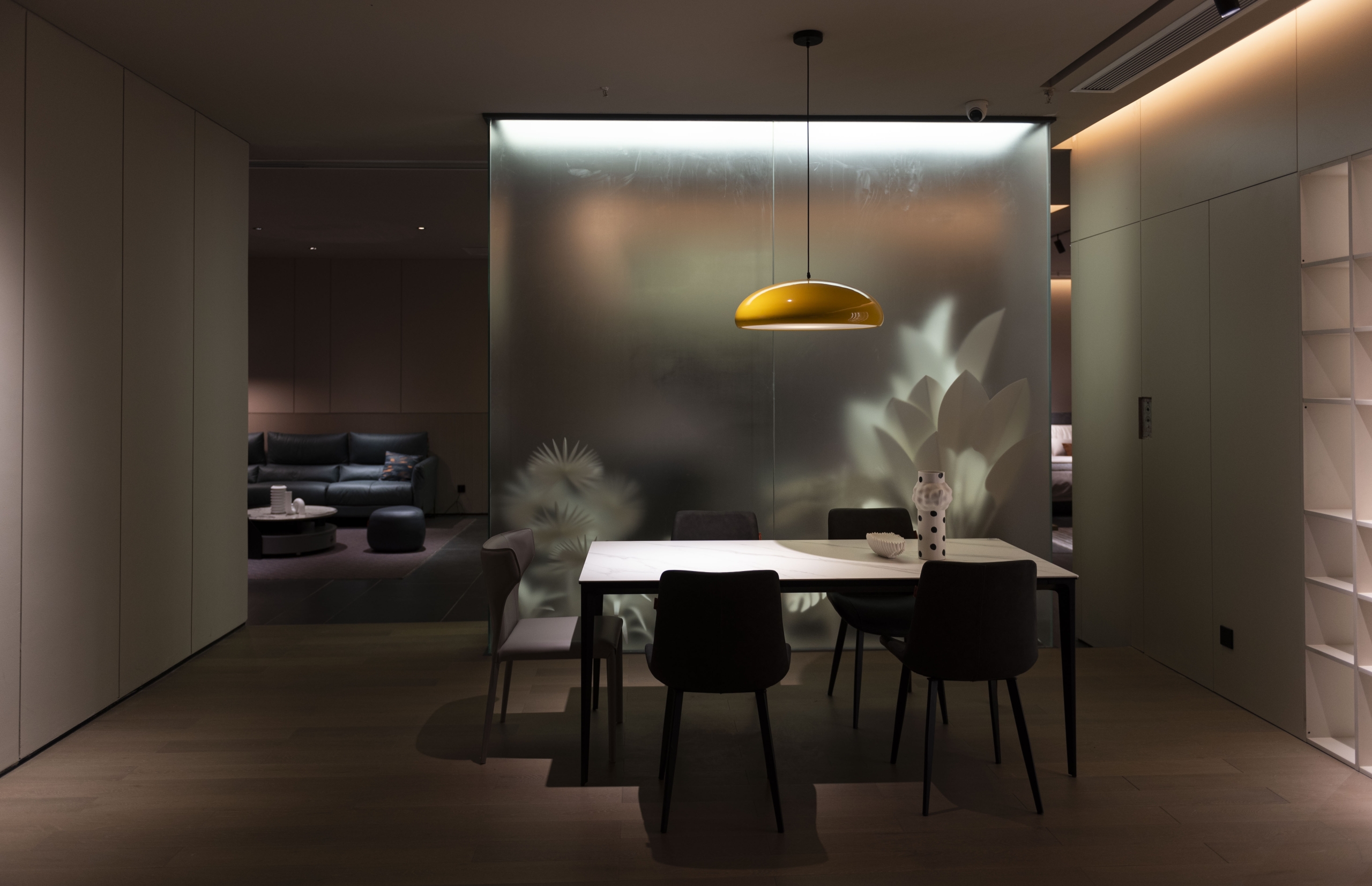
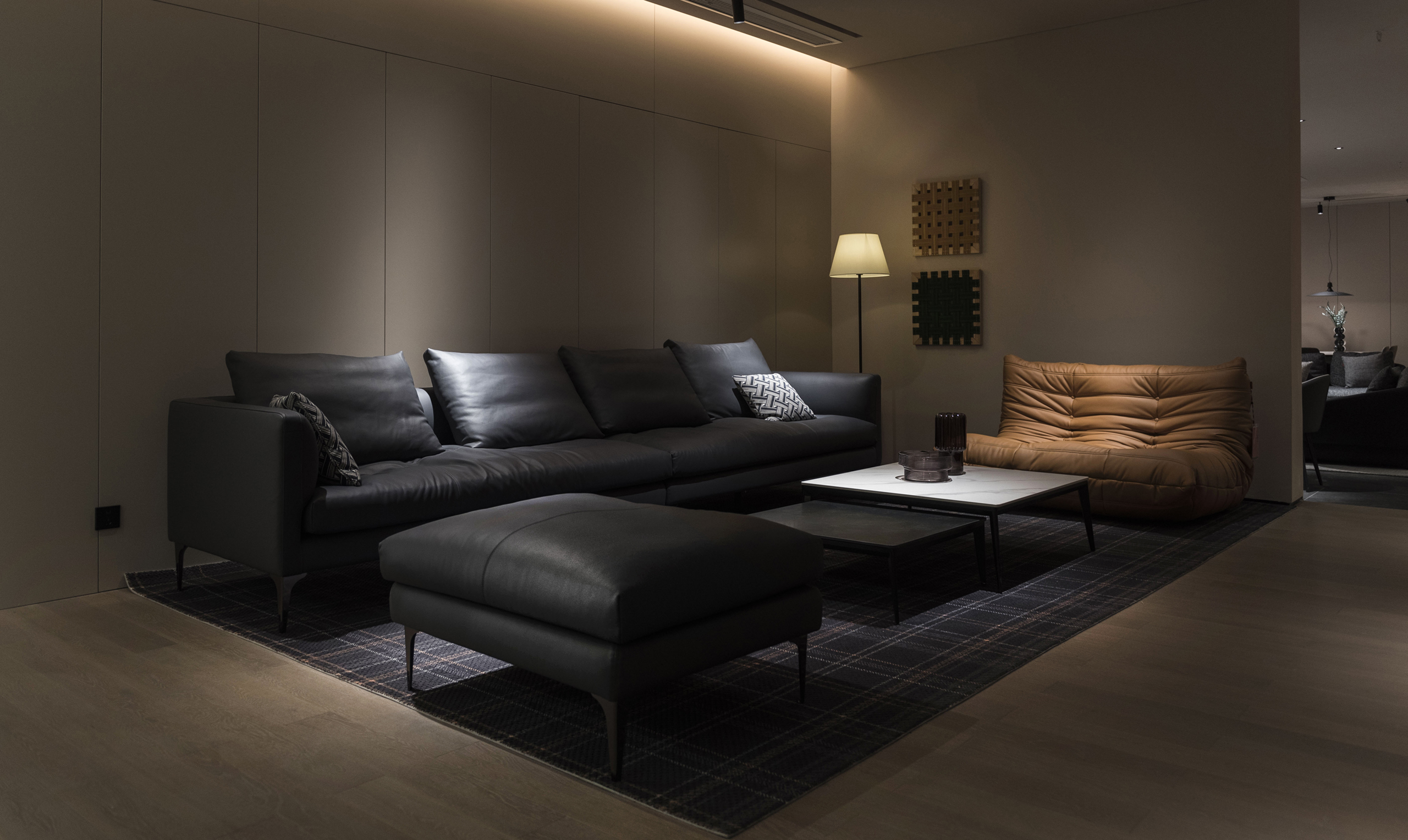
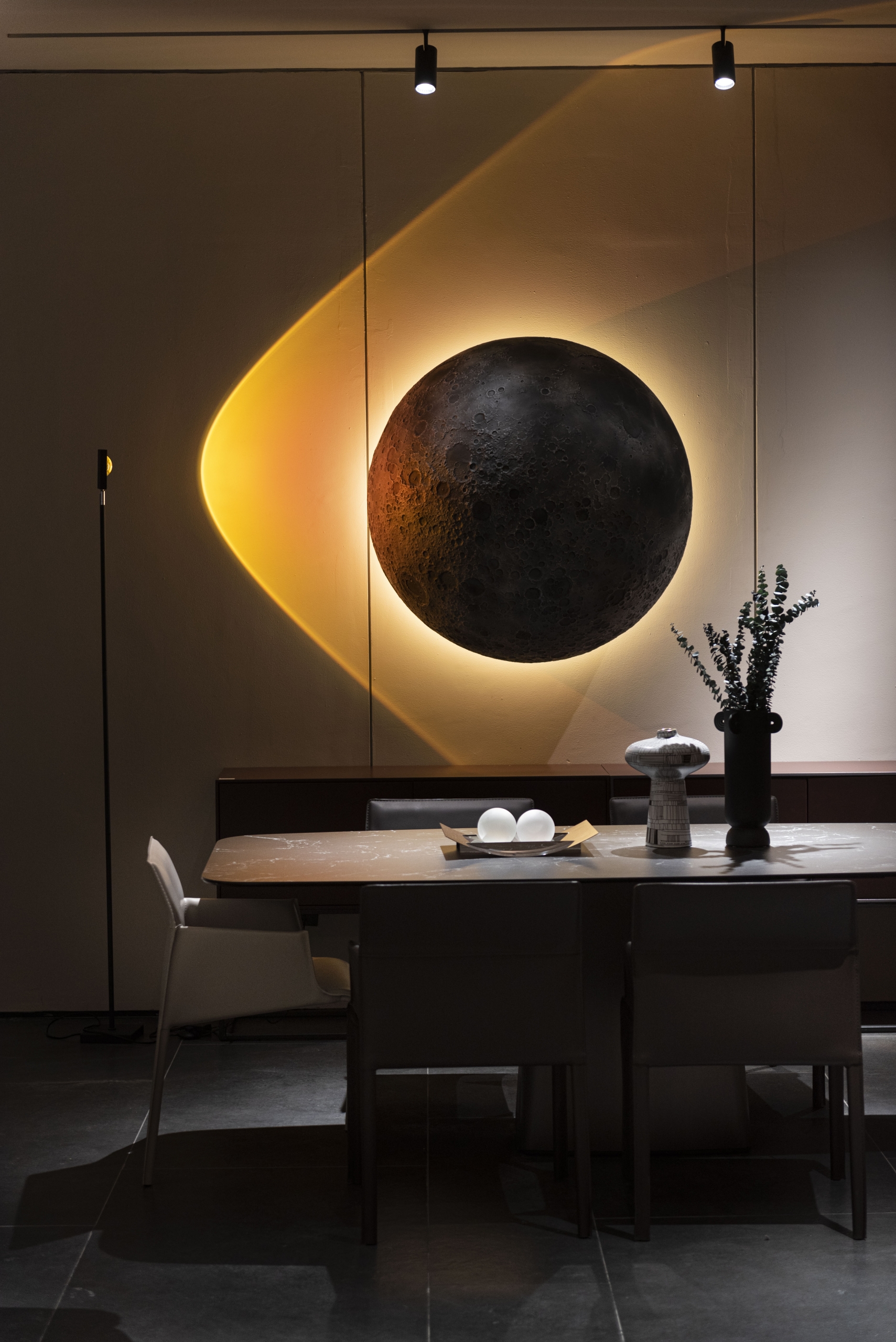
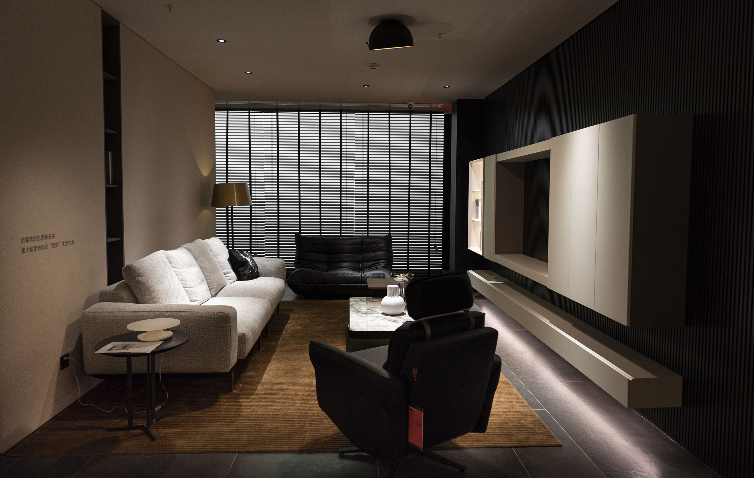
相比一层以潮流/生活为属性的定位,二层空间更多地回归到以产品属性为主的家居情景空间。客/餐厅成品家具场景展示为主。家具场景搭配各俱风格的软装饰品,为消费者提供满足个性家居空间的风格指引。橙色元素及产品材质以不同形式贯穿空间,制造着视觉连贯、细节丰富的空间体验感。
When “young, trendy, and social” has become a must for retail businesses to seek changes, traditional home furnishing stores are not bystanders to this “boom”.
D&B HOME explores unbounded breakthroughs in the tangible terminal space, allowing us to see the unexpected changes and “cross-border” of traditional home furnishing stores again and again. The use of a large area of orange materials, finishes and LED screens has established the style tone of the space, showing a younger and more lively atmosphere, and there is even a sense of “bizarre” atmosphere in the contrast between light and dark.
Compared with the positioning of the first floor with trend/life as the attribute, the space on the second floor returns more to the home scene space with product attributes as the mainstay. Customer/restaurant finished furniture scene display mainly. Furniture scenes are matched with soft decorations of various styles to provide consumers with style guidance that meets the individual home space. Orange elements and product materials run through the space in different forms, creating a visually coherent and detailed spatial experience.
view
INSPIRING WITH DESIGN
在这场“橙色风潮”中,看似“越界”的视觉与设计手段背后,是产品与体验,场景与交互,色彩与光感多重关系的平衡与取舍;正如橙色的温暖与大胆双面属性,这是一次设计语言的突破与求新,也是一次谨慎的介入。进入这场“风潮”,剩下的交给自我与感知……
In this “orange trend”, behind the seemingly “out-of-bounds” visual and design methods is the balance and choice of multiple relationships between product and experience, scene and interaction, color and light perception; just like the double-sided attributes of orange’s warmth and boldness , this is a breakthrough and innovation in the design language, and it is also a cautious intervention. Get into this “wave” and leave the rest to the ego and perception…
-300x102-1.png)
